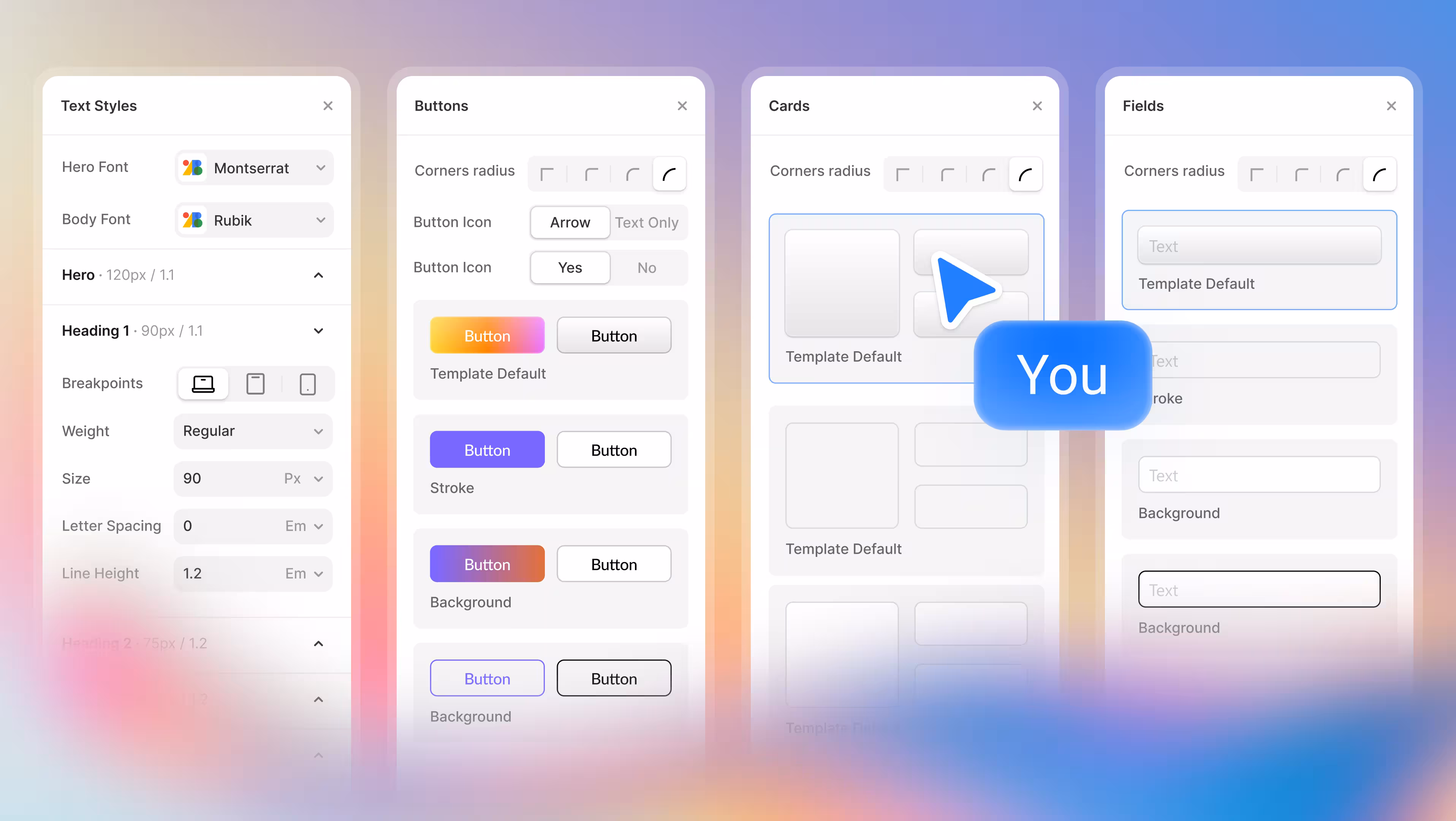
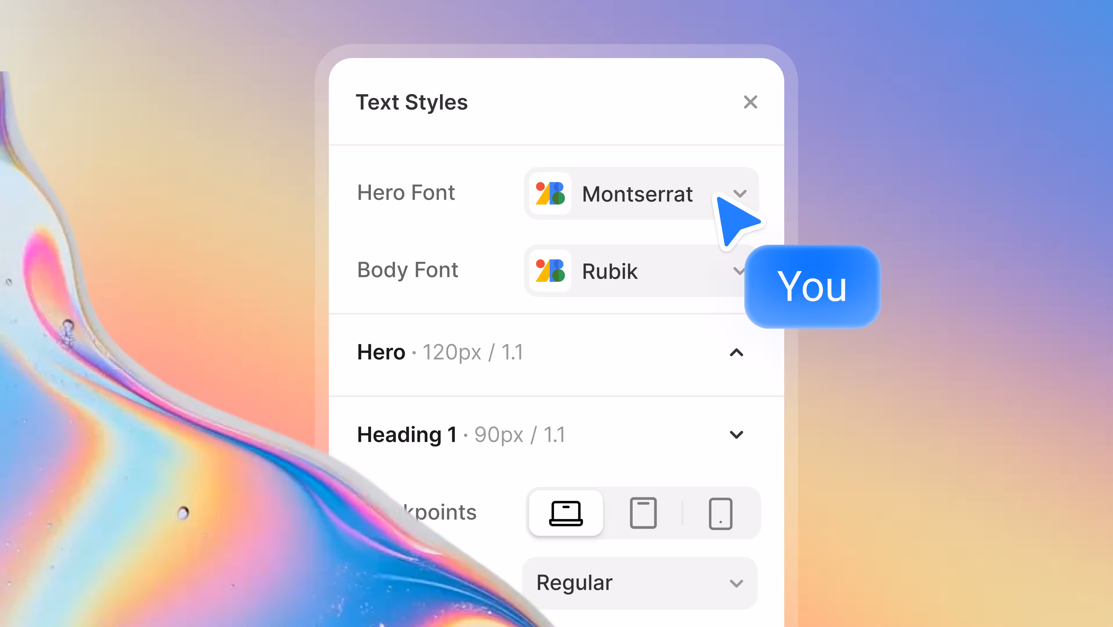
Typography System
The new Typography System in Modulify gives designers full control over their text hierarchy from a single place. Instead of adjusting font sizes and spacing manually on every page, you can now define hero text, headings, and body typography globally. Any change you make instantly cascades across your entire design, ensuring consistency without repetitive work.
This upgrade dramatically improves how designers explore and test visual hierarchy. You can quickly experiment with different heading scales, spacing ratios, and font balances to see what works best for readability and brand expression.
Whether you’re designing a content-heavy site or a bold marketing landing page, typography changes no longer require redesigning components one by one.
Once your typography feels right, your design is already structured for production. Modulify translates these typography decisions cleanly into Webflow-ready styles, reducing guesswork and preventing mismatches between design and implementation. What you design is what ships.
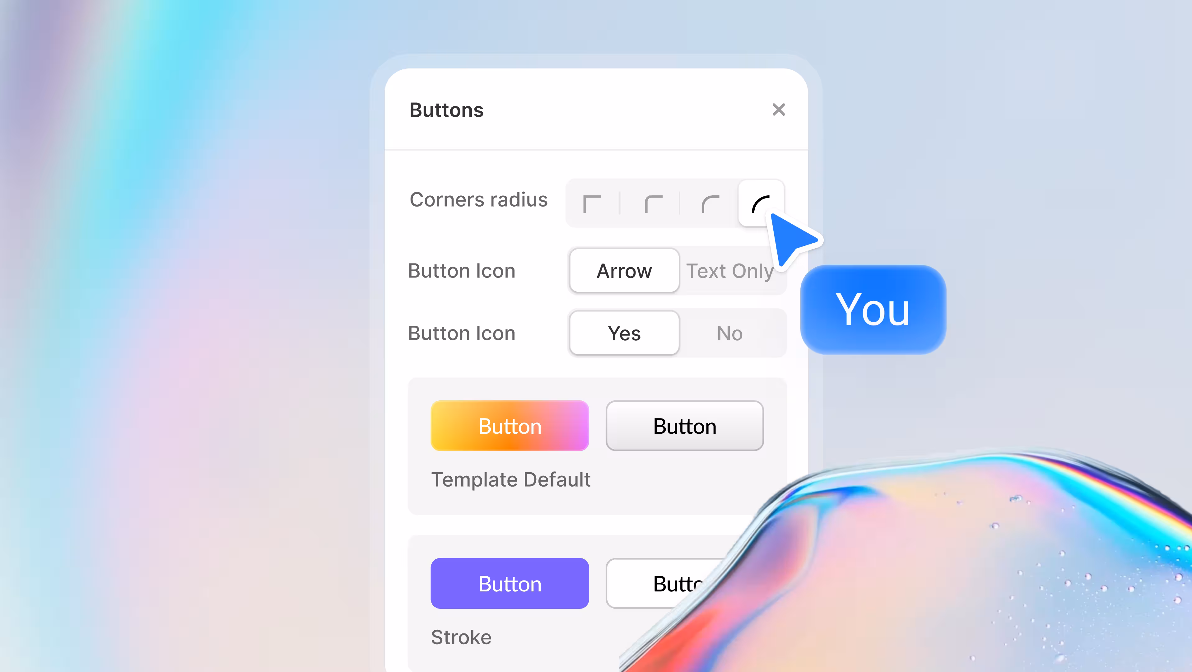
Button Styles
Buttons are one of the most reused components in any interface, and inconsistent button styles are one of the fastest ways to make a product feel unpolished. With Modulify’s new Button Styles, designers can define primary, secondary, and alternative button styles globally, including border radius, outlines, and icon behavior.
This allows designers to test different visual priorities quickly. You can explore how sharper or rounder buttons affect the feel of your interface, adjust emphasis between primary and secondary actions, and refine contrast for better accessibility and conversions—all without touching individual buttons. It’s fast iteration without visual chaos.
When the design is ready to move to Webflow, button styles are already standardized and predictable. Developers or no-code builders don’t need to reinterpret design intent—your button system is already defined, scalable, and production-ready.
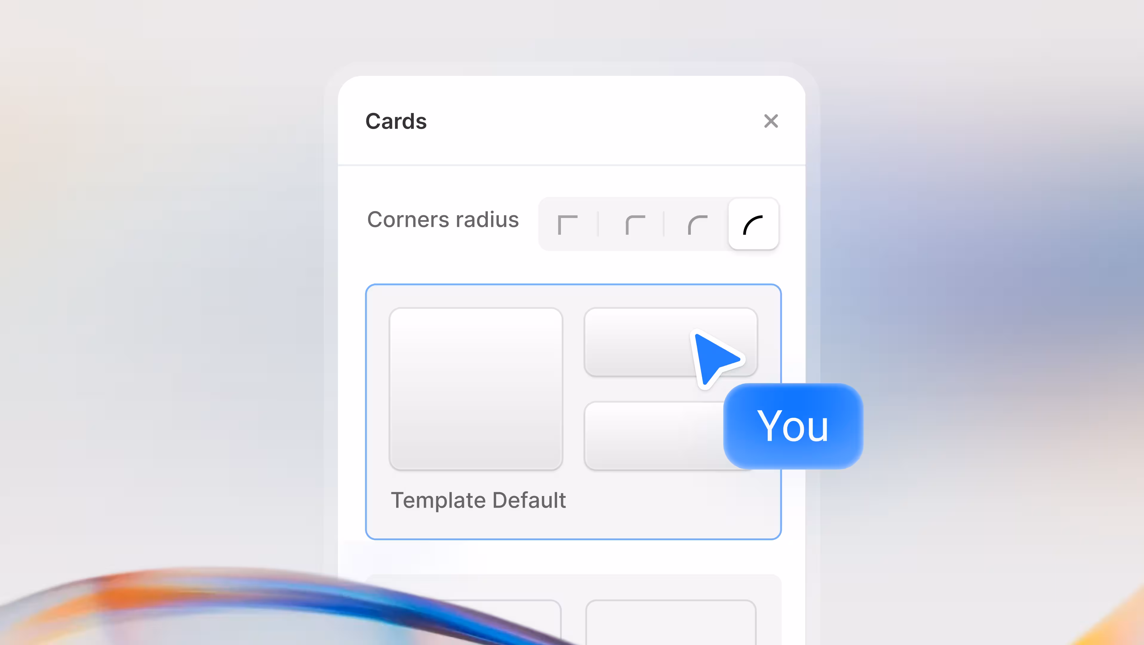
Card Styles
Cards are foundational layout elements, and small inconsistencies in their styling can quietly undermine an otherwise strong design. Modulify’s Card Styles let designers control border radius variations globally, making it easy to define how structured, soft, or expressive a UI feels.
This feature empowers designers to experiment with visual personality at a system level. You can instantly switch between sharper enterprise-style cards or more rounded, friendly layouts to see which direction best supports the brand. These changes apply everywhere, helping designers evaluate the overall tone of the product instead of isolated components.
Because card styles are centralized, designs exported or rebuilt in Webflow remain visually aligned across sections and pages. No more mismatched containers or manual corrections—your layout system stays consistent from concept to live site.
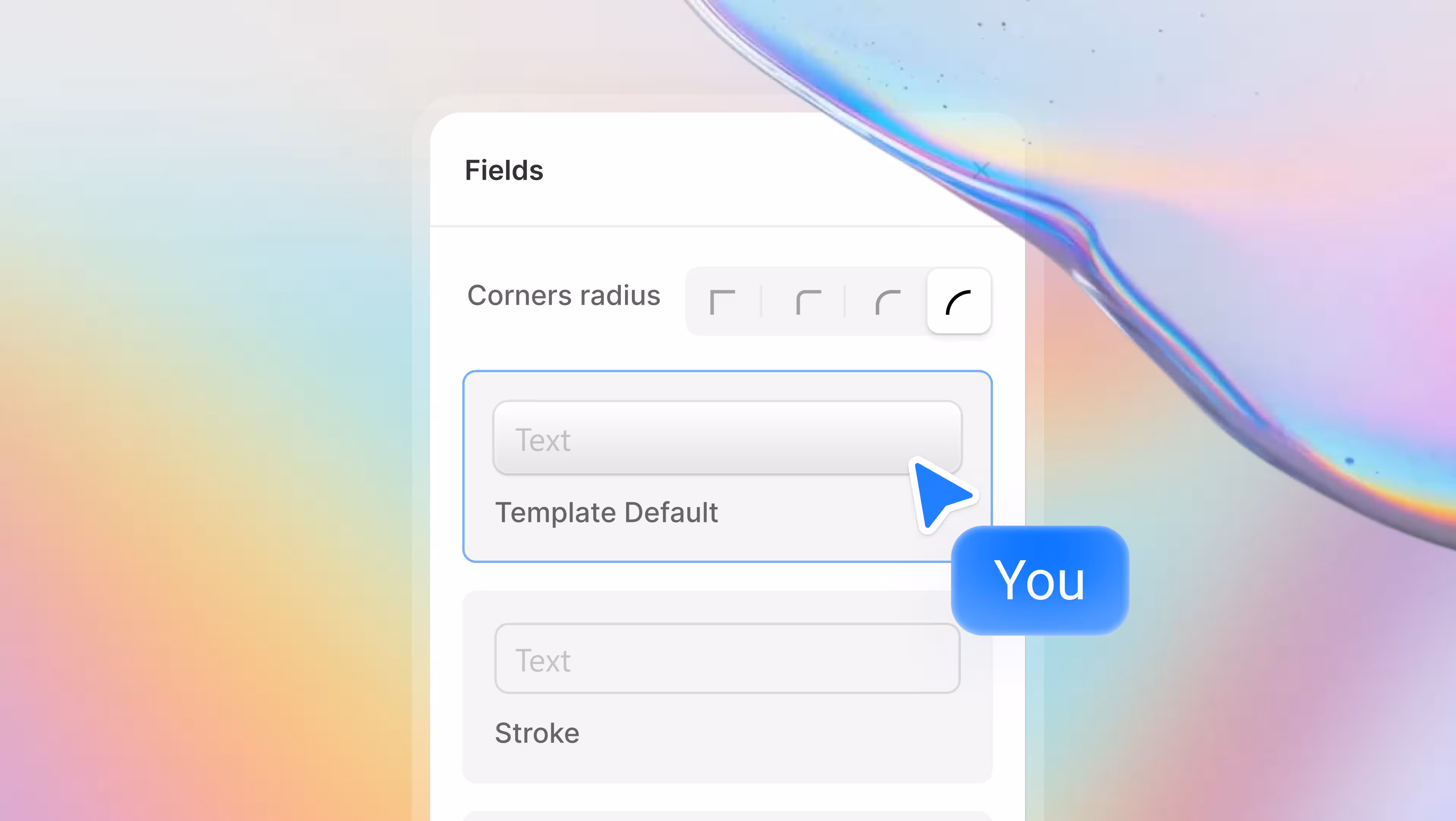
Field Types
Forms are where UX mistakes are most visible, and inconsistent input styles quickly erode user trust. With the new Field Types in Modulify, designers can choose from multiple field styles and apply them across all inputs globally, ensuring forms look and behave consistently.
This makes it easier to test different form aesthetics and usability patterns. Designers can compare bordered inputs, minimal underline styles, or boxed fields to see what best suits the product’s audience—all without rebuilding forms. The result is faster iteration and fewer usability regressions.
When preparing designs for Webflow, standardized field styles eliminate ambiguity. Inputs translate cleanly into reusable components, keeping forms accessible, predictable, and visually aligned with the rest of the interface—ready to publish without rework.
Try these and other great features!