
Design
The Prompt Is the New Design Brief
April 23, 2026

Follow us
There's a moment that keeps happening in design teams right now. Someone types "make me a landing page for a SaaS product" into an AI tool, gets back something that looks like every other AI-generated landing page, and concludes the tool isn't ready yet.
They're not wrong about the output. They're wrong about the cause.
The output was generic because the prompt was generic. A designer wouldn't hand a developer a one-line brief and expect a branded, on-strategy website. They'd write a proper brief: who it's for, what it's trying to do, what it should feel like, what references to pull from, what to avoid. But drop them in front of an AI site builder and the same designer will type "landing page for SaaS" and hit enter.
The skill isn't prompting harder. It's briefing better. And briefing is something designers have always known how to do — they're just doing it into the wrong interface.
What changed
For most of the last thirty years, the design brief was an artifact. A PDF. A Notion page. A thread of Figma comments. It traveled between humans, each of whom interpreted it through their own experience, taste, and assumptions. A good designer reading a mediocre brief would still produce decent work because they'd fill in the gaps with judgment.
AI doesn't fill in gaps with judgment. It fills in gaps with averages.
Ask for "a modern SaaS landing page" and you get the average modern SaaS landing page across all the ones the model has seen. Centered hero. Three-column feature grid. Gradient accent. Stock-y product screenshot. This is what people are complaining about when they talk about the "AI look" — not a flaw in the model, but the statistical center of what it's been asked to produce.
The shift is that the brief is now executable. What you write gets rendered, literally, in minutes. There's no designer in the middle to catch ambiguity. If the brief is vague, the output is vague. If the brief is precise, the output gets surprisingly close to what you had in mind. This is the same logic behind vibe coding replacing traditional no-code workflows — the interface moved to natural language, so the quality of the language started to matter.
The leverage of a good brief used to be measured in meetings saved. Now it's measured in renders saved. A precise brief gets you to a usable v1 on the first try. A lazy brief gets you to generic output that needs five rounds of corrections to fix.
What designers already know that prompters are forgetting
Read any decent design brief and you'll find the same ingredients:
Who it's for. Not "users" — actual specific people with actual specific problems. A B2B procurement director at a mid-market manufacturer is a different audience than a Gen-Z skater, and the design should look nothing alike. "Landing page for a SaaS product" tells the AI nothing about the person who's supposed to click the button.
What it's trying to do. A page built to get demos booked looks different from a page built to drive self-serve signups, which looks different from a page built to educate a market that doesn't know the category exists yet. One measurable conversion goal should be visible in the layout before you've read a word of copy.
The vibe. Designers spend entire careers learning vocabulary for this — editorial, brutalist, retro, technical, luxurious, utilitarian — and then type "modern and clean" into an AI tool. "Modern and clean" is the design equivalent of telling a chef "make it tasty." Specificity is what rescues the output from the average.
References. Good briefs point at examples. "Think Linear's site for the feature sections, Stripe's for the typography rhythm, and Monocle magazine for the editorial density." AI tools absorb this kind of reference reasoning well — better than they handle abstract style words, because the reference implicitly carries a hundred decisions the prompter didn't have to articulate.
Constraints. What must be true, and what must not. Required elements (logos, compliance copy, specific CTAs). Banned moves (no stock photos, no gradient text, no emoji-style icons). Designers always knew constraints were generative. Prompters keep forgetting to write them down.
Brand context. Voice, tone, color philosophy, how the brand talks about itself versus how competitors talk about themselves. This is usually the single highest-value paragraph in a brief, and it's the one most often missing from AI prompts entirely.
None of this is new. It's the same brief structure design agencies have been using for decades. The interface is just different. The problem is that when the interface looks like a chat box, people write chat messages. When it looks like a search bar, they write search queries. Neither of those is a brief.
What it looks like in practice
Here's what a lazy prompt gets you:
Create a landing page for a productivity app with a hero section, features, testimonials, and pricing.
Here's what a brief looks like, loaded into the same box:
Landing page for a productivity app aimed at solo founders and small creative agencies — not enterprise. Primary goal: self-serve signup, no demo gate. The vibe is editorial and calm, closer to a Substack publication than a typical SaaS site — generous white space, serif headlines, functional typography over decorative illustration. Reference: the visual density of Every.to combined with the product clarity of Linear. Absolutely no gradient blobs, no abstract 3D shapes, no centered hero with a product screenshot on a tilted plane. Include a hero with a single clear value proposition, a three-section feature breakdown that reads like a magazine spread rather than a feature grid, one quoted testimonial, and transparent pricing above the fold of a dedicated pricing page. Headlines should feel confident but not hyperbolic — the voice is more The Economist than TechCrunch.
Both prompts produce a landing page. Only one of them produces a landing page that anyone would recognize as belonging to a specific company with a specific point of view. The difference isn't the model. It's the brief.
Anthropic, the company that makes Claude, publishes detailed prompt engineering guidance that converges on the same conclusion from a different angle — clarity, specificity, and examples are what separate good outputs from average ones. HubSpot's guide for web designers lands in the same place: instruct with verbs, provide context, break complex tasks into parts. The practitioners who write about this all converge on something designers already know about briefs — just with different vocabulary.
Why this is good news for designers
There's a worry in design circles right now that AI is coming for the craft. The framing is usually something like: if a non-designer can type a prompt and get a site, what's left for the designer?
A lot, it turns out — but the valuable part moves upstream.
When the output is a render, the brief becomes the craft. The designer's value isn't in moving rectangles on a canvas; it's in knowing which rectangles should exist, in what proportion, expressing what idea, for which audience. That work hasn't been automated. It's been amplified. A designer who can write a precise brief can now ship five directions in an afternoon and let the strongest one survive — something that used to take a week of production time.
The designers who are going to do well in this shift are the ones who treat the prompt the way they've always treated a brief: as a discipline, not a task. Who study what works in AI-generated web design the way they used to study awards annuals. Who build prompt libraries the way they used to build reference boards. Who learn that the input side of the tool is where their judgment compounds.
The ones who struggle will be the ones who keep treating the prompt box like a search engine.
The practical takeaway
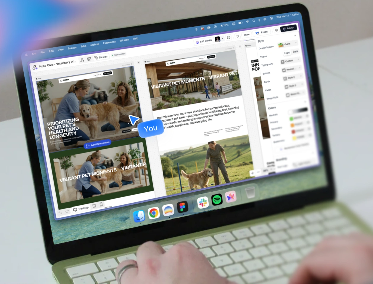
If you're a designer working with any AI tool — Modulify, Figma Make, v0, Lovable, anything — the single highest-leverage move you can make this quarter is to stop prompting and start briefing.
Write your next prompt the way you'd write a brief for a junior designer who's never worked with your brand before: audience, goal, vibe, references, constraints, brand context. Keep the briefs. Refine them. Notice which ingredients matter most for which kinds of output. Within a month you'll have a personal prompt library that's more valuable than any tutorial you could read, because it's calibrated to your taste.
The tools are getting better quickly. The interfaces will keep simplifying. But the gap between a good brief and a lazy prompt is going to keep widening for a while yet — and for now, that gap is where craft lives. It's also the reason we're building the new Modulify 2.0 around the prompt as a first-class artifact rather than as an afterthought to a visual editor.
The brief didn't die. It just moved into a text box that happens to render.
Modulify treats your prompt as a real brief — audience, vibe, references and all — and produces sites that reflect the precision you put in. Try it with your next landing page.

Discover and grow your audience with the checklists in our free guide.
Effortless Web Design starts here. Try Modulify Now!
The only playground you need to build Webflow websites with AI in minutes.
Design & Build Webflow sites in minutes with AI